Flourish is a data visualization and storytelling platform that helps data enthusiasts understand and communicate complex data. With a wide range of customizable templates and interactive features, Flourish makes it easy to create beautiful and engaging visualizations that tell a story and bring data to life.
There are many different types of visualizations available in Flourish, including maps, charts, and diagrams. You can use these visualizations to explore data trends, discover insights, and communicate findings to others. For example, you might create a map to show the distribution of a particular type of data across a geographic area, or use a chart to illustrate how a particular metric has changed over time.
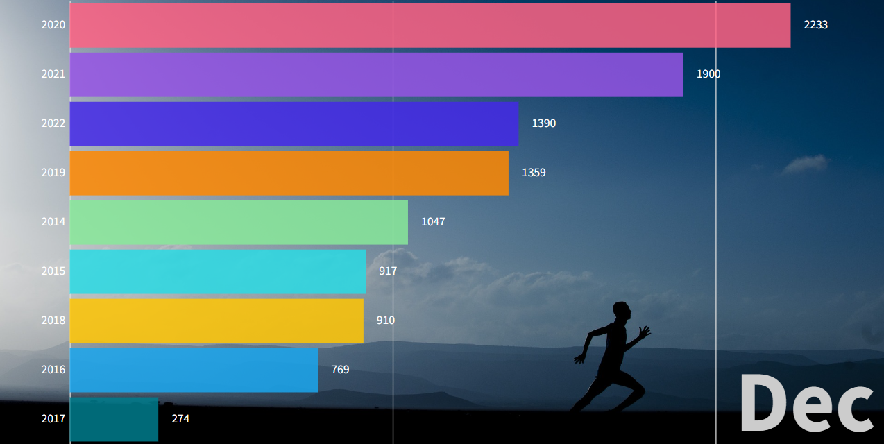
Below is an example of a bar chart race with data from my runnings. The bars increase by the distance I ran during a specific month. I collected the data in an excel sheet (Argh ) and uploaded the data to lourish. Flourish studio offers a free plan with plenty of templates and examples with sample data.
The direct link to the visualization is Running distance by year.
Overall, Flourish is an excellent self-service tool for anyone looking to visualize and communicate complex data in a clear and engaging way. Flourish helps to create appealing visualizations.
